the FN-INK Revolution:
Branding, Creative Direction & Content Strategy
When ink prices skyrocketed, the industry had two choices: accept the squeeze or fight back. FN-INK took a stand, and I made sure the world noticed.
I spearheaded the creation and development of FN-INK’s brand identity, creative direction, and content strategy, transforming it from an ambitious idea into a multi-million-dollar global powerhouse. More than just ink, FN-INK became a movement, an industry disruptor with a bold voice, rebellious energy, and a clear mission: SAVING PRINTERS MONEY.
-
![]()
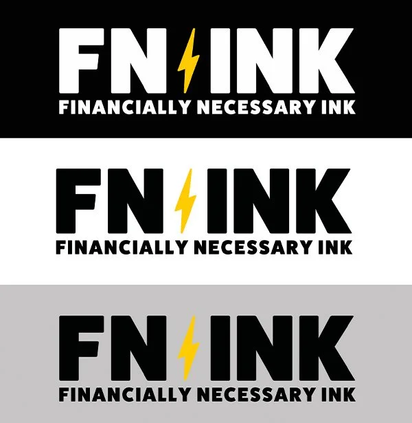
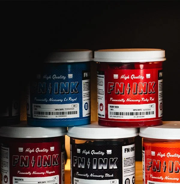
LOGO DESIGN
It all begins with an idea. Maybe you want to launch a business. Maybe you want to turn a hobby into something more.
-
![]()
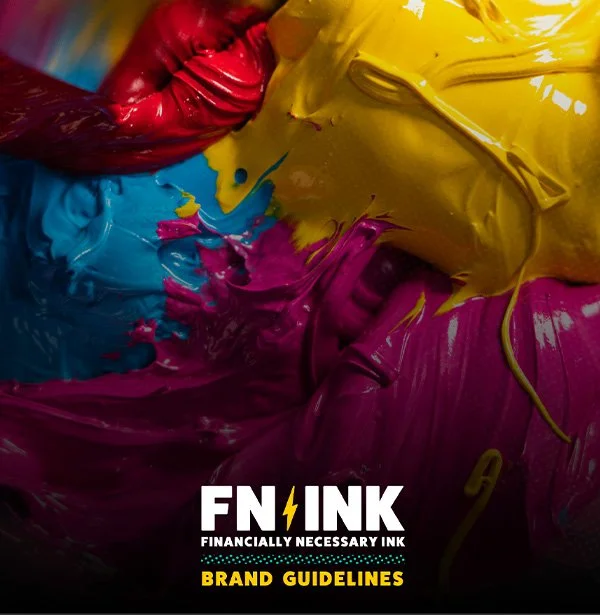
BRAND GUIDELINE DEVELOPMENT
It all begins with an idea. Maybe you want to launch a business. Maybe you want to turn a hobby into something more.
-
![]()
PRODUCT IMAGERY
It all begins with an idea. Maybe you want to launch a business. Maybe you want to turn a hobby into something more.
-
![]()
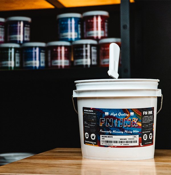
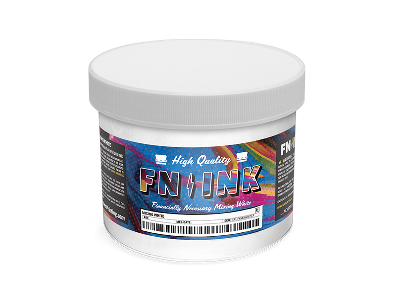
PACKAGING DESIGN
Description goes here -
![]()
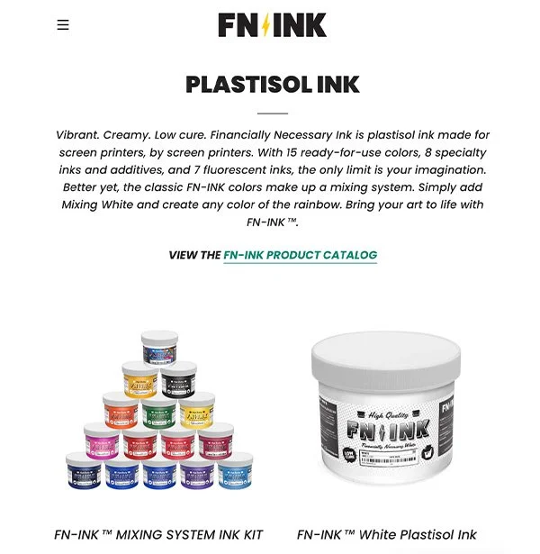
FN.INK BRAND SITE
It all begins with an idea. Maybe you want to launch a business. Maybe you want to turn a hobby into something more.
-
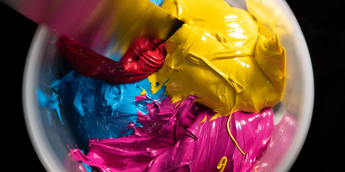
![]()
LIFESTYLE CONTENT CREATION
Description goes here -
![]()
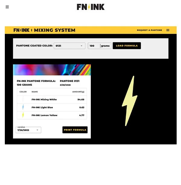
MIXING SYSTEM INTERFACE
Description goes here


Brand Identity: Punchy. Colorful. Rebellious.
FN-INK wasn’t built to blend in. It was designed to shatter the status quo and disrupt an industry weighed down by overpriced, overhyped inks. Just like the screen printers who rely on it, FN-INK thrives on boldness, creativity, and defiance. It’s not just a product. It’s a protest against industry giants who put profits over printers.
Inspired by the subversive genius of Banksy and the pop-art revolution of Andy Warhol, FN-INK embraces contradiction. It’s both raw and refined, playful and powerful, rebellious yet strategic. The brand challenges expectations with vibrant visuals, punchy messaging, and an attitude that refuses to be ignored.

CREATIVE DIRECTION
BRING YOUR ART TO LIFE
FN-INK isn’t just ink, it’s a movement. Every visual, every word, and every touchpoint was meticulously crafted to do more than sell a product. Inspired by Banksy’s rebellious edge and Warhol’s punchy aesthetic, FN-INK blends street art’s raw energy with the precision of high-performance printing. The brand leans into halftones, bold color blocking, and high-contrast designs to create a distinct visual identity that feels both nostalgic and modern. The use of grainy textures, distressed overlays, and exaggerated pop art stylization reinforces FN-INK’s DIY, screen-printer-first ethos. Every design choice is a nod to the art of printing itself—imperfect, hands-on, and full of character.
The pop art influence goes beyond aesthetics; it is ingrained in the messaging. Just as Warhol transformed everyday objects into high art, FN-INK elevates screen printing ink from a commodity to a cultural statement. The visuals are loud, the colors are electric, and the halftone textures add depth and grit. This intentional stylization makes FN-INK instantly recognizable, setting it apart from sterile, corporate competitors. The brand doesn’t just fit into the screen-printing world—it redefines it with a playful yet rebellious energy that speaks directly to the printers who live and breathe their craft.


Content Strategy
TAKE A STAND
Content was more than just engagement; it was about empowerment. I developed a content strategy that positioned FN-INK as a champion for screen printers, seamlessly blending education, entertainment, and advocacy into every piece of content.
With this approach, FN-INK did not just enter the market, it made an impact. It has grown into a multi-million-dollar global brand, trusted by screen printers everywhere. More than ink, FN-INK is a statement, a revolution, and a call to arms.